Monday, March 19, 2012

Stormy Weather


While walking through Newport this weekend I noticed the sky had the most interesting contrast of color. I felt as though a painter had taken his brush and put a blue streak through a pink sky. There is a definite contrast of warm vs. cool. Not in the pink  lighting (which still has a cool feel to it), but right in between the pink and the blue light. As if there is an energy fusing the two lights together.
If someone were to ask for a romantic evening of stormy weather, I feel this would be a wonderful composition. It makes me want to walk with someone special along the damp sidewalk hand in hand.

Week 10 - Shining Arizona


Here we are at the end! My final blog for this class. I found it fitting, since I've talked about reflections so much on here that I should end on a new kind of reflection. When I took this picture I was absolutely fascinated by the multiple reflections of my can on the surface of the table. It's kind of hard to tell in this picture, but there is one reflection that is basically just the shape of the can and it looks like it's going straight down into the table. The other reflection which I like MUCH more is the crazy pattern that seems to spread across the surface of the table. This expanded version of the word "Arizona" on the can was really cool to look at, (ask anyone I was with that day, I was flipping out). Unlike my other posts about reflection, which talked more about white light reflecting off glass or water, this particular example is color from one metal reflecting off another metal. I think this could be used in really spectacular ways if a lighting designer paired up with a set designer and we saw a set with dull metal walls or something like that, so instead using a cyc, you could project emotional colors onto this dull, semi-reflective metal which would give off a really nifty effect. I like it. I want to try it.

And Thanks Lonnie! This class has been great =) My favorite of the quarter, hands down.

Sunday, March 18, 2012

Week 10: Mi Casa :)

Last weekend I got the chance to take a trip back home to celebrate my dad's birthday. While at the family get-together, I managed to capture a quick snapshot of  our dining room as my family served their plates with yummy, traditional Mexican food. I enjoyed a wonderful evening with them as I do with anytime we get together. I must say this is probably my favorite place to be when I am home. As you can see we have a lot of lighting fixtures and strung "chili" lights that adds to the warmth and specialness of this room. My family and I constantly enjoy many dinners together which is why I associate every bit of detail in this dining room with the special moments I have shared with them. It is a great place to be and definitely becomes much more magical with the help of the colorful lights!

Week 10: The Mental Hospital

This weekend, I was in my friend Brittney's student film for Biola. We went to shoot at an abandoned building that was once part of a mental hospital (which is now Cal State Channel Islands). The lighting of this picture adds to the general spookiness of the entire place since there is no one obvious source of light that can be seen. The white walls reflect the color of the clouds above them, a mixture of whites, blues, and blacks. The lack of green in the grass reminds you that you are in a place that once was habitable, but now only yellow, dead patches survive. The only hint of green is the weeds that soak up all the water that may have allowed for life. The dark gray asphalt leaves a sign that there is obviously a way to get out, with the tragedy that no one in the hospital was allowed to leave on their own freewill.

Dana Lillie

Week 10- Dancing Lights

This is a picture of dancers warming up before the last performance of barebones this past Saturday in the Claire Theatre. They were constantly moving so the picture is blurry, but I think that helps capture the colors that are being projected onto them. I like that this photo shows where the light is hitting the stage and dancers. Two of the dancers are painted in red light, while the rest are in blue. In the blue light, the actual color of the dancers’ outfits are more distinguished, and the outfit of the dancers’ in red light are hard to see what colors they are actually wearing. There is also a spot on stage that looks a little grey, which may be the points of overlapping of the red and blue light on the black dance floor. 


Week 10: After the Storm


So, as we all know, it rained this weekend. No surprise there. But as I was in the car, I looked out the window, and saw this.  Immediately I thought, I have to take a picture of this.  There are so many things I love about this picture.  First, there are still raindrops on the window, second, you see the sun peeking out of the shadows, and third, there is not only a rainbow, but two rainbows in this picture.  After this class, I learned that rainbows aren't necessarily "real".  All it is doing is breaking up white light into its actual parts, being the light spectrum from red to purple.  There is something very natural and symbolic about this picture that I love.  Though it is very cliche, it reminds me that you can't have the rainbow without the rain.  I also love how the sun is peeing through, as if to say there is a light after the darkness; you just have to wait through the storm to find it.  Wow, I'm such an intellectualizer.  But yes, I love this picture.

week 10 - Do you believe in Magic?

And here we have Disney magic! I have an annual pass so I try to get my money's worth and go as much as possible. Tough life, I know... :)
Anyway, I love the lighting here because it really draws your eyes in. The castle in the daylight is a light pink with a blue/grey roof. The colors and angles chosen here really enhance the castle's best features and create deeper dimension. The It looks like the lights from the balcony shining on the heart of the castle are part no color and part pink . I also like the light inside the rooms. It makes it look like there is something going on inside and creates more life to it. The pinks create the "magical" look that Disney strives to emulate and spread. The stark color contrast between the castle and the archways is enhanced by the lighting. The dimmer lighting in the archway creates a more relaxing and welcoming atmosphere to walk through to fine more Disney magic!

Thank you for a great class! I learned a lot.

Week 10: SoCal

This is at 6 am while I was on my way to work at the University Town Center across the street from UCI. I remember in the last week we had class, Jaymi was mentioning the differences between a sunset and a sunrise. She was talking in class about someone's presentation how to make a sunrise more distinguishable form a sunset by the use of more lavenders and cool colors as opposed to the bright oranges and pinks that happen in a sunset. When I took this picture originally I just took it because the sunrise was so vivid and I was super groggy. I didn't really think about why I liked it. After examining it now, I could see what Jaymi was mentioning.  I also loved it because of the palm tree. I grew up in northern California, and taking this picture I thought it was so iconic of southern California.

Portal to the Sky - Week 10

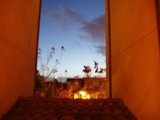
While walking back to my apartment from campus, I noticed how dark and pretty the sky looked and decided to take a picture of it. This is not what it looked like. The sky was far more saturated in color and bluer in hue. The walls were far darker and grayer. I think that the flash on the camera, as well as the lights caught near the bottom of the picture warmed up all of the colors in the photo. Initially I was somewhat annoyed that I didn't get the nice cool colors I had seen, I did rather end up liking the end result.

I really like the contrast of the cool light blue getting gradually darker to the warm orange. The way the orange surrounds the blue is somewhat reminiscent of a portal to an outside world. The warm, dark clouds seem to slowly encroach on the open cool blue in an almost mysterious manner. This definitely turned out far better than I had expected.

Week 10: Experiencing the Magic

Friday night resulted in a last-minute trip to Disneyland, complete with Monte Cristo's, the firework show, and of course Fantasmic. I was with a friend who had never experienced any of the above, which made it even more exciting to watch her reactions as she discovered the uniqueness of each. This is the part of Fantasmic where the pirate ship comes out with Peter and Hook high above the rest of the cast as Wendy watches anxiously from below. Not only is the lighting incredible in this entire production, but this accidental capturing of light in the photograph was particularly magical. One of the spotlights from behind was shining through which created a sun flare effect, creating a glow around the entire photograph, and consequently blurring the heads of the audience members in front of me. To me this really captured the magic of Disney and the ability the creative team there has to sweep audiences away into a world of imagination and fantasy. PS my friend loved the whole thing! There's something to be said about that Disney touch.

Week 10: I See Trees of Blue

This photo was taken on the bridge that connects South Coast Rep to South Coast Plaza (near the Claimjumpers). Costa Mesa is nice and all, but the architecture and lighting in some of the more swankier parts are what bring this little city to life. I've walked this bridge MANY times (so I don't have to pay for parking), and it's just stunning the difference day and night makes...literally. In the day, this bridge is a big slab of concrete that is an overpass to Bristol. The street is lined with lots of trees and the big mall across the street is artificially lit. But at night, this bridge is surrounded by these same trees and tons of deep yellow and blue architectural lights. The trees are blue!! I thought this was such a cool effect that goes unnoticed by all the cars zooming by below. I was also super impressed with the lights that were able to light this whole tree from top to bottom, giving it the indigo glow. Props to you, Costa Mesa.

Week 10: The Cooking Party

So I had the luxury this quarter of having many friends who were freshmen. This means free food at commons because of guest swipes. So to show my appreciation to them for all their love and companionship, I decided to have a cooking party at my apartment for them. During the party, I took out my camera because I figured "why not." And this is one of the pictures I came out with. Not only do I think this picture is hilarious because of the face Caitlin is making, but I also think it's beautifully lit. It was early afternoon and the sun was shining in my living room window so wonderfully. I love the sun, if you couldn't tell from the previous pictures in my blogs. At any rate, it just made me so happy how bright it was inside my place without lights needing to be on. And I just chose this picture because, well, it's silly and I like silly things. :).

week 10- Finale (.... or finally?)

I took this picture off the balcony of a friend's house. It overlooks UTC. I thought it was a beautiful sight. The sky was hazy with muted light that had been trapped in the atmosphere by the clouds. This made the lights from the movie theater really pop and give it a sense of majesty. My eye was really drawn to the theater. Then to add to its glory, the wet pavement reflected the light magnificently. It was interesting to see how much light there was in the area as a whole considering it was just past midnight when this photo was taken. This just goes to show how far lighting can go and just how powerful it is.

Thank you Lonnie, Dan, and Stacy for such a fun quarter in lighting!

-Ashley Henley

Week 10: My Cousin


This is a picture of my cousin, Kevin. I took this when my family and I went to get some dinner to celebrate a birthday. I really liked this picture because I felt like the lighting really helped convey the mood of this photograph. For so background description, I love Kevin because he is a hard worker, kind hearted and just overall a really nice guy. He works really hard and he doesn't complain at all. He keeps a lot to himself and sometimes I feel like he has a lot of pain and worries, but he just masks it with a smile and a positive attitude. With this lighting, I really think that pain and weariness really shows through this picture. The shadows that cover most of his face really accentuates his dark eye circles. The small light lining the profile of his face creates an emphasis on his face and also provides a great contrast with the shadows on his face. This just shows how lighting can really alter the mood and tone of a photograph and emphasis the underlying emotions coming from the subject.

Can't believe this quarter has gone by so fast. I really enjoyed getting the opportunity to take photos and I loved learning how to use the gels and set up my own cues. I definitely have a better appreciation for lighting. Thank you for the wonderful class!

Friday, March 16, 2012

Week 10 - Midnight Drive

I was driving home from a friend's house in Irvine back to Newport Beach. It was very late and I was looking for a way out of Turtle Rock, but I could not find the way back. I had to pull over and look up directions back to PCH in order to get home. While I pulled over, I noticed how pretty the streetlights were in the mist that was hanging in the air. There was no one on the road, but there was a stillness in the atmosphere. The way the moisture in the air floated and the quiet of the night set a stage for me to notice the beautiful lighting. The reflection from the street lamp made a a spotlight in the road and it created a magical compilation of lighting. It was an unexpected discovery.

Wednesday, March 14, 2012

Week #10: Me and My Lil

All of my past posts have been pictures of the sun and natural lighting scenes, but I wanted to push myself on my last blog and attempt to discuss in door lighting. I chose this picture of me and my greek little sister, Stephanie, because I liked the softness of the light and the shadows it created on our faces. I also liked that the hanging light bleeds and shines a bright light throughout the background of our picture. It creates a softness and due to the intensity of the light and its source it dulls the sides of my own face while defines Stephanie's face a bit more. My face captures more of the light making me seem more orange or yellowish but due to my height it creates a cool contrast due to the shadows of myself on Stephanie's face. I think what I like the most are all the vivid colors that are brought forward through the intense, bright, concentrated light source.

Saturday, March 10, 2012

Week 10: Don't walk here alone at night...


This is a creepy hallway if ever I've seen one. This is the staircase leading up to the Parking & Transportation Center way on the other side of campus. The weird thing is, this staircase isn't exactly inside a building; the bottom of these stairs opens right out into a bright and sunny parking lot, and just around the corner at the top of the stairs the sun is also shining bright. But in between these areas of natural light, I had to venture through this weirdly-lit hallway that made me feel like I was in a horror film being pursued by an ax murderer. The light wasn't just that awkward fluorescent color-- it was a disconcerting reddish-orange. Most hallway lights are either white, yellowish, or oddly greenish, but this light's strong red-orange hue made me feel like I was being beamed up through a portal onto Mars through the single light fixture directly above me. Even though the hallway was probably very cool in temperature, the lighting made it seem like I was walking into an oven, and I was acutely aware of how uncomfortable I felt just because of the lighting.

Wednesday, March 7, 2012

Week 8: A Day in the Park

It's amazing how much we can be affected by a little bit of sunshine. I'm sooo loving being in Southern California where it doesn't stay cold for a lot of the year. I was having a pretty bad week and then I went to the park with my friend Caty. Even laying down in the shade, we felt so relaxed and calm. It was almost surprising that we had been stressed at all to begin with. I love this picture because it completely exemplifies everything great about that day. It was beautiful and carefree. We didn't care who saw us being crazy on the grass-- it was just nice to feel that free.

Tuesday, March 6, 2012

A Beautiful Storm Week 8

I couldn't believe how beautiful that awful storm was last week. It created the perfect opportunity for me to view some incredible lighting when I got home from campus. I love the way the sky opens up and reveals light that pours through and downward onto the ocean. Even though it was a pretty crazy and violent storm, the colors are calming and give a sense of relief when I look at the photograph. With the violence of nature, often comes a beautiful spectacle out of it and I think I captured this. My favorite art of the photo is that far out in the distance you can almost make out a ship and it seems that the light that has escaped the clouds is creating a spot for it to be seen.

Week 8- A Calm After the Storm of Life

This is a photo that I took on Saturday evening as I was on my way to work. It was very significant to me because I had just come off of a very hard week and as I was driving, the song Sweet Child of Mine, by Guns n' Roses came on and it is one of those songs that hits home for me. As I drove I looked out my passenger window to see this beautiful sunset and the blend of colors reminded me that even when life gets really murky and it seems like the sun will never come back out, there is always beauty as you watch it leaving and it will always be back for an even more exquisite sunrise. I thoroughly enjoyed how the cool light blue blended with the warm burnt orange and the bright gold. As the sun continued to set over the dark sillouette of the mountains, it made me feel much more calm due to the cool tones of the sky as the yellows turned to lavendars then into the navy blues.

Monday, March 5, 2012

Week 8: Golf Course Source

I took this shot from my balcony this weekend in the beautiful 80 degree weather morning on Sunday. I have to add some credit to my camera for capturing the awesome source in the left corner, for what I was really drawn to were the patterns on the grass and the streams of light coming through the branches of the trees. I especially love the brightness of the plant in the bottom right corner in contrast to the darkness of the tree trunks; I'm pretty obsessed with the depth this creates. After presenting my Our Town project, I have really been focusing on the source of light in every day life (as well as in each scene of Hello Again which we teched this weekend. :) ). This photo makes me very smiley. The light is really alive, bright, and entices you to go have a picnic under the trees. I wouldn't advise it, though, as this is the green of a golf course. Beware of rogue golf balls.
I had the opportunity to see Spamalot at the Pantagas theatre in Hollywood today. Unfortunately, I was unable to take a photograph. I noticed that the lighting altered  drastically with the mood of the play. When the king began to speak about an idea, very far-fetched, the lighting changed from a light, somewhat naturalistic lighting to a purple haze. The purple let the audience understand that the ideas he was speaking of were not of what was happening in the moment. I thoroughly enjoyed how the quick, drastic change of light let the audience understand a concept without the use of words. It enhanced the idea.

Sunday, March 4, 2012

Week 8: MACBETH!

For this weeks lighting blog I really wanted to present the incredible lighting done in the Macbeth workshop on campus. I took this photo during the dress rehearsal the night before opening night. I must say though, the picture does not serve justice in capturing the perfect lighting color Ashley Casias selected for this piece. Watching her work come to live on stage really taught me so much in regards to our discussions on color and how that can really have strong emotions attached to them. The greenish light really worked for me as a viewer in that I felt as if the sense of Macbeth's desire and corruptness was becoming much more prominent as the play progressed. I felt the light reflected off the banners in the background really worked well in providing a type of canvas or backdrop. It produced a nice gradation of not so intense color on the bottom of the banners and a heavier concentration of color near the top. Overall, I felt this was an excellent choice and really helped in pushing the performance forward as well as highlighting elements of the set. 

Week 8: The Happiest Place on Earth

I feel slightly self centered by posting a photo of myself, but I love the lighting so here it is! I took this picture back in October when I went with my sister to Disneyland. What I love most about the photo is the heavily saturate lighting and how that affects the way the camera took the photo. The outline of each specific light bulb in an orange glow makes the viewer feel as if they are pulled into a mystical world, where things are not as they appear. The light coming in from the back gave the skeletons an austere appearance, as they are in this world yet part of another. However, the orange glow gives the photo a cheery Dia de los Muertos feel, in rejoicing in the life of the dead. If the light were red, the mood would be much darker and bloodier, which would not be so fitting in the Happiest Place on Earth.

Dana Lillie

Week 8 - February 29th

Not everyone can say they have seen Disneyland's Main Street at 6am, but I can; on February 29th, I visited Disneyland for their 24-hour Leap Day event and was able to experience the park in a much different light than usual. The sun had just risen and was hot and bright, and everything appeared washed out. Shadows were especially long. It became clear to me the main differences between sunrise and sunset: the sunrise is hotter and more intense, while sunsets tend to be warmer and less bright. The shadows in the morning are stark and defined, while evening shadows are softer. It's weird that morning light and evening light look different; in theory, the sun should be at about the same angle, just on the opposite side of the horizon. . . but they are definitely different. If I were to light morning on the stage, I would use a cool color and light from almost directly above. For sunset, I would use a warmer color and light from a side angle.

Walt Disney Animation Studios


This picture was taken on an extremely cool trip to The Walt Disney Animation Studios in Burbank. Me, and the rest of the cast members from Turtle Talk With Crush got to tour the studio, the Disney Archives and go inside the animation building itself which is off limits to even most cast members. This particular building is the Michael D. Eisner building located at the end of the Disney Legends Plaza. What I enjoy about this photo is the strong sense of source and the ways the light play off of the different parts of the area like on the columns on the right side of the picture. What the light doesn't play off of, which I think works to an advantage, is the main building itself. There is no light creating any shadow on the building, but I think it creates a sense of majesty and groundedness to the structure. And yet there is a lot of light giving the structure detail so you can see what it is. It is as if there are giant imaginary box booms on both sides of the stage with some soft center light. However there also appears to be an imaginary back source light which gives the building that slight "god light" effect which plays very well into the power and stature of the building.

Cooling off at Moss Cove


This past weekend a friend and I decided we needed a break from stress, so we took a trip up to Moss Cove Beach in Laguna. Now although I didn't technically take this particular photo (he did), I fell in love with the lighting and wanted to put it in my lighting blog.
This day was a perfect combination of relaxation and fun. The soft yellow light just above the ocean (at the horizon), coupled with the light breaking through in the upper left hand corner of the photo show the energy within the calm hues of blue. Another reason why I chose this photo is because of the perspective. Since it was from our point of view, it is easier for the observer to visualize the tone of this photo and the way the lighting further accents that tone. Also by having it from this perspective, you can see the way the sunlight was hitting us (the source). It wasn't a harsh, overbearing type of light, but rather a softer, cool light. The seagull was pretty cool too.

Sad but Happy? Cool contrast- Week 8


Hey all, How's it going? Why I love the light in this photo is because by all means it should be a sad moody type photo, but it isn't. I took this photo in Brooklyn at my friend's apartment complex. Don't ask me why the view is amazing and how he manages to live at such an upscale sight because I could hardly believe it myself. The wonderful sight in the back round is covered by the foggy clouds, yet it helps convey the city as a wonder of mystery. It piques the curiosity and you kind of want to explore it. I just love that mysterious feel of Manhattan in the back round and contrasting it with the uplifting feel in the front. It was really foggy that day and despite the weather, this is a really uplifting happy photo of friends enjoying each others company. It really expands on that idea of how light of any color can give off a different mood or intention by changing the intensity. Bringing this idea back towards theater lighting, I could see how if you see up the lighting to be a warm sunny day in California, you could still use those same lights and still make the set be sunny, but also tell the story of whats happening in the scene.

Week 8: Creepy Tree


When I was home this weekend, I was talking to the house after I had parked the car and I saw this bare tree with the lights behind it along the way.  It caught my eye because there was this eerie feeling to the setting.  You can't see it in the picture, but behind the tree and the lights in the darkness is a lake.  So imagine the black lake with random naked, gnarly trees being illuminated by scattered lights.  For some reason, it felt like Halloween, and the cold temperature at night added to the emotion.  The way this tree was illuminated from behind with the lights, it looked like the tree was nothing but a shadow and didn't really exist.  The picture doesn't do it justice.  As I took the picture, I began thinking about the picturization project we did in class and how I could light this exact situation on stage and what it would look like.  I don't know what it is about this eerie, gnarly, naked tree and the lights, but I'm fascinated with it.

Beneath the Canopy - Week 8

This photo was taken this weekend while walking around campus, by Engineering Lecture Hall. Although the sky is still rather bright here, it actually wasn't too long before sunset, between five and six. You may be able to pick out some of the very light orange in the sky. I like the way the light shines through from the top of the canopy and illuminates some of the vines and flowers on the top, but immediately beneath those areas, the shadows are the darkest.  It's only as you go further from the source that the shadows lighten up. The white light effect is quite apparent here as, things beneath the canopy are still easily visible, but everything beyond it are shined on quite brightly, appearing to bleach the colors.

Week 8:: Friday Night Lights

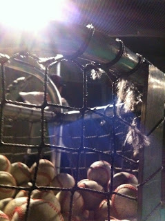
You know you're in love when you get out of your pajamas and back into everyday clothes to watch your fiance hit batting practice in 38 degree weather at 10:00 at night.  Even though I was freezing, my heart became warm as metal hit leather, creating the loud "thwack" that echoes then disappears...one of my favorite sounds! This photo was captured on accident. One of those beautiful mistakes. I clicked unexpectedly and loved the way the light was captured. The rays of the floodlight resemble the sun, creating the effect there are signs of day in the middle of the night. It was almost like being stuck in a limbo. The glare that's shining in the middle of the photo blurred out the batter's body in the background, highlighting the baseballs on the front-ground. I loved that nothing in this photo is highly distinct or outlined, but the light in the corner gives it a sudden brightness that in my opinion makes the game of baseball so magical. 

Week 8: Summer is Near

I took this picture Saturday at about 6:40pm. The temperature was still warm from the day and reminded me that summer is near. The sky was perfectly clear and solid blue, but the colors of artificial light projected a yellowish color. The contrasting colors are like the transition of seasons, which also reflect the upcoming holiday, Holi. The trees are still bare and they look like they are reaching up to the sky. When I took this picture I felt really relaxed, but now when I am looking at it I am a little confused. I think I might be confused because there are a lot of things I didn’t notice when I took the picture, and now I am noticing more details that I didn’t see before.

Week #8 - My Sister


So this is my older sister, Joann and last week I was able to take some photos of her. We decided take a walk around our neighborhood when the sun was going down. Unfortunately most of our photos were really dark, but I stumbled upon this picture. I loved how the sun, from the right side, created interesting shadows on my sister's face. I actually think that this effect made the photo much better and dynamic. This image can convey moods of nostalgia, mystery, hope, etc. This reminded me of the Our Town project I presented last week. I had a hard time choosing the colors and gels for each scene, but I knew how I wanted to use the no color lights to convey a certain mood. Colors are great, because they can help communicate certain moods. For example, red is obviously perceived as a color of love or anger. But I believe that using no color lights are most essential because it creates distinct shadows and can lighten or darken the person on stage, which is the main purpose of lighting. That is why I think that this image of my sister works. We are able to see things we normally don't really see in a well lit photo. We can see the distinction of her high cheek bones and the shape of her eyes.

Week #8: Light Through a Mirror

I think what really attracted me to this picture was the contrast of colors, moods and angles that is offered between the two different locations. I also think it's interesting to see how the light of the sun differs at different locations; ahead of me was light blue sky, with soft colors and then in the mirror there was an intense focus where the light was coming from and the cloudy sky created sharp angles. It reminded me the calm before the storm, driving towards clearer skies, and leaving behind the turmoil and chaos. I loved how this was the same sky but the source of the light changed the mood and how clouds and other obstructions created sharp angles.

Week #8- Warm vs. Cool

This is a picture of some apartments near my home. I like it because it shows a great contrast between cool and warm light. The shadows reveal a definite source of light, which has been a major topic of critique on our lighting projects. Anyway, back to the contrast. For my Our Town project I am looking to show a transition between late afternoon into evening. This picture really gave me an idea of the quality of soft warm light the sun would be giving off just around dusk. I also like the shadows because while they are cool, they are definitely still lit. The shadows are not dark and ominous, but rather gentle and inviting. All in all this sight just really got my creativity flowing for my project and served as a good example of how natural light should look.

-Ashley Henley

Saturday, March 3, 2012

Floating Lights of the Claire! - Week 8

As I was walking home from Studio 4 the other night I couldn't help but notice the images of the streetlights reflected in the glass walls in front of the Claire. It looked like the lights were floating in midair with no supports. It was a very mystical look that I had never noticed before that night.

To apply this to class, I think the ability to successfully use reflections in a design would end in a stunning result. Many special effects or just cool area lighting could be created with well placed mirrors or pieces of glass. Unfortunately I know from experience how annoying it can be for an audience member when a light is reflected right into their eyes while they are trying to watch a show. I don't really know how to get around this issue. Perhaps using a lower intensity lamp? Anyways, if it were possible it would be super cool.

Week 8: Dimension

I parked at the top of my friend's apartment parking structure next to Diamond Jamboree and went through a maze of white wall, cement floor hallways until I reached a hallway where all of the doors to the apartments were. I don't know if it was because I was struck with insane asylum white hallways before I got to the hallway the hallway that I have taken picture of, but I thought the lighting in this hallway was really different from other apartment complexes I have been to. I tried to picture this hallway without this highlighting of the walls, and I think it would appear narrower than it does now. I think the angle of the lights, the placement and spacing provides more dimension and depth to the hallway. It definitely doesn't provide the dimension that two lights from two different angles focused on one point would, but it does add a different effect to the walls. The lighting breaks the monotonous one tone color of the wall and the dark paint color. If the designer just used regular ceiling lights, I think the color of the walls would make the hallway appear darker and longer, almost like a "Green Mile" "dead man walking" kind of appearance. This design does not incorporate additional color to the lights, but merely a simple pattern of lights.

Sunday, February 26, 2012

Week Six: One Night of Queen!!

This past week I got the opportunity to see an amazing performance at the Riverside Fox Theatre. Not only was the show fantastic, but the lighting was pretty phenominal as well. From earlier in the week when we got to see the "rock show" lighting sample, I was inspired and upon going to see Queen, I found myself analyzing the lighting structure from song to song. This particular song was a solo instrumental piece by the guitarist. From the lighting, it may seem evident that he was alone on stage playing somewhat of a more mellow song and that was exactly what he was playing. I also noticed that the designer was using gobos in the purple light to create the spirals on stage and the fact that I was using the light to enhance the concert made me realize why lighting designers do what they do. They really know how to liven a performance!

Wednesday, February 22, 2012

Week 6- Source of Light


This photo was taken in the living room of my apartment. I thought it was really fitting because we have been talking a lot in class about the source of light. The source of light in this picture is very well defined as the sun from outside. There are also very defined beams of light on the floor, wall, TV, and guitar.  The difference in shape and quality of light on these beams differs depending on the reflectivity and shape of the surface it is hitting. For example, the TV and guitar give off a harsher, glare or reflection of the light while the carpet shows a more soft and inviting feel to the light. This reminds me of the importance of knowing what kind of surface or fabrics I am lighting in order to create the right look.

Overall, the sunlight seeping in through my window gave a warm and inviting feeling to my living room. As a result, I spent the whole morning in my living room.

-Ashley Henley

Week 6: Color Wheel on Campus

I took this photo the other day while on the way to Hello Again rehearsal. The shot is from crossing the Humanities bridge from the Student Center, headed towards Humanities Plaza. This literally stopped me in my tracks because of all the colors I was seeing at once. The sky had created an insane blend of indigo, blue, and magenta and I thought about how awesome that would be to create on a cyc. What I also love about this is the source of light coming from HIB from inside all the hallways. This reminded me a lot of the effects I saw in Merchant of Venice and how the lighting designer had backlight coming through the left and right wood panels. The colors here are so aesthetically pleasing, and the orange/yellow of the building light mixes so nicely with the cyan and magenta of the background. Since we're jumping into gels soon, I couldn't help but notice how nature creates these wonderful pictures for us. Nature's own color wheel for the win!

Monday, February 20, 2012

Week 6 - River Walks

Upon my visit home to Northern California for the weekend, I went on a river walk. I tend to do this when I am home because there are so many things to see - wildlife, people, river movements and of course the lighting. I went at around 4 in the afternoon. I love how even in winter, the light casted a beautiful warm glow on the water and made the whole scene look like a special place in the woods just for me to enjoy. The ambers of the trees and deep slates of the water contrast nicely with one another. I think the lighting creates a somber tone, however, and makes me feel a bit lonely when I look at it.

Week 6: North 110 Pasadena Freeway


While going about the freeways of Los Angeles, I managed to take a picture of these tunnels. I though this had a unique perspective of light and dark as you can see the tunnels continuing further down the road. This reminded me of our discussion regarding source of light and how that can also draw our eyes to a specific object or person. The source of light coming from the sunlight is brightest on the tunnel entrances. My eyes immediately go to the brightest spot of the tunnel in the photo. The extremes of light and darkness also assist in guiding our eyes to view the overall composition of the photo. Although I did not plan how to take this photo I'm glad I was able to capture the upcoming tunnels in the distance which also continue this pattern of light and dark.

Week 6: A Light at the End of the Tunnel

 This is the hallway outside of my apartment. It looks pretty gross, but something that I have always like about it is how hopeful it looks. My Dad always told me the phrase "There's always a light at the end of the tunnel" while I was growing up, and this hallway is the perfect representation of that. The light inside the tunnel is dimly lit by fluorescent lights, making the color of the hallway and your skin slightly unnatural. Compare that to the strong light from the sun outside with natural hues, it creates a stark contrast shown where the hallway ends. To me, it shows that man can try to make a cheap imitation of light and what we use every day to see, but it is dismal in comparison to natural light. However, maybe there is a hope that one day we can get theatrical lighting to look this good.

Dana Lillie

Sunday, February 19, 2012

Tribute to the Captain EO Tribute


This photo was taken by one of my friends while at Disneyland outside of the Captain EO show and I thought it fitting because of the recent work we have been doing on how source can affect the composition of a photo. I really like the way this picture came out because it has the cool silhouette effect, yet it is not a complete silhouette. There is a secondary source of light coming in from the right that accentuates a few features of my face that reveal my expression as well as my arm and the main colors in my shirt, yet keep sort of an intensity to the photo. The cool part about this was that this was taken very quickly without any thought to composition or how the various lighting sources would effect me in the photo. I love accidents like this. I would like to know at some point if this effect can be reproduced on stage in the same way.

week #6: in the woods


file://localhost/Users/nchavez/Pictures/iPhoto%20Library/Previews/2012/02/19/20120219-225537/IMG_0735.jpg

Okay, so first of all, for some reason my computer isn't working and isn't refreshing my uploaded pictures so I linked it to my picture instead. I'm going to try and figure out the problem in the meantime. As for the photo I was actually on a date with my boyfriend driving back to Indio from Idyllwild and the sun was breaking through the trees and it was just really stunning to me. The intensity of the light washes out part of the trees and creates a nice glow around the circumference of the sun creating lighter colors around the border of the photo. I also love that the light is so intense that it causes the camera to create red streaks as if fire is coming from the center of the burning light. I think this image has tones of inspiration and strength that really drew me into using this as my image for the week. 

Week 6: Work Related Adventures


While working this weekend at Rainforest Cafe in Downtown Disney (Anaheim), I noticed for the first time how realistic the lighting was. This picture doesn't do it justice, but the lighting is manipulated in a way that makes it look as though the sun is peeking through the trees. This reminded me of Grant Markin's lighting presentation last Wednesday (bittersweet exploration).
While waiting to be seated on the bottom floor of the restaurant you can see rays of "sunshine" that make bold streaks, as though it's coming through a small crevice or canopy, and then cascade down the steps towards you. When I took the time to notice the lighting on these steps, I realized how realistic it looked. I felt as though I was inside a stone temple somewhere in the rainforest ready to start a new adventure. The lighting gives an inviting, adventurous atmosphere to the steps that makes one want to climb them to see what lies ahead.
I really wish the picture would have turned out better. Maybe you'll just have to come visit me while I'm working to see what I mean. :)

Week 7: Hide and Seek

While I was taking a day to myself, I went to The Spectrum. I parked in the parking garage and when I got out of my car I thought that the sun was beautiful. I remember in class we were talking about how lighting a stage can be confusing if you can't see the source of light. In this, the source of light is clear and provides a mood of rebirth or a heavenly view. The sun is clearly the source of light, but is not overpowering because it provides shadows and provides depth to the clouds of highlights and casting shadows in other parts. I love how the light also provides a little bit of reflection on the cars to see them slowly peering which makes them hidden until you realize they are there later.

Week 5-6: Sunny Window


I took this picture the other day before leaving for class. I like this picture because it shows the angle of the sun based on the time of day, which was morning. Without seeing the window, it also reveals the type of window and the window’s structure. The shadows in the outline of the window are interesting because it is not the exact shape of the leaves and trees outside my window but still indicates that there are trees out there somewhere, and because of this it reminds me of focal point two. To create this I suppose the pattern that was being projected would have to be away from focal point two so it would not be a crisp edge of the trees and leaves. 

Week 6:: A Love As Bright as the Sun


This weekend I was exploring a thrift/antique shop and in the backard of this quirky little house that had been turned into a secondhand shop, there was this beautiful wooden distressed fence and about every 5 feet or so, there was a heart cutout in the planks and the only word I could think of was darling.  The backyard was a mess, with old ladders, chairs, and doors strewn across the weed-infested yard and hidden behind it all was this little piece of beauty that stuck out in its own special way. Because the sun was starting to set in the background, I was being blinded by the bright rays that were sliding past the fence as I studied the curious wooden slats in front of me, I was struck by the image that love is brighter than the sun. Okay, not literally, but in my opinion, nothing shines brighter than the actions, words, and  sentiments that are motivated by love, express love, and embody love. I loved that the photo captured the sun rays slowly disappearing in the sky while the heart cut into the fence remained visible. It showed that even though the sun was going down, the "love" remained. And while the sun will fall asleep for the next 12 hours, that heart will remain carved into that fence, and that's how love should be. Etched, unfading, and constant. 

Week 6: Birthday for the Robot

One of my friends, Kirk aka The Robot (aptly named for his complete void of human emotions), turned 25. I decided it would be really cool to make him a cake with the amount of candles as his birthday (he had previously mentioned this was not possible after you turn 10). When I lit the candles, I was really excited because there were so many candles the flames almost looked connected. I have a mild pyro streak, so it was definitely a high point of my day. It didn't even matter that Kirk was not impressed by my massive skills. There's something completely fascinating about natural light and how fire seems to break the laws of physics by traveling up, while everything solid around it stays down. It just makes me happy. :). Also- I love birthdays.

Week 6 - Good Cookin'


I took this picture at an awesome Japanese restaurant, one of those where they fry the meal right in front of you and you never get cold because of the flame that practically touches the ceiling. Even though the flame isn't entirely visible in this snapshot, its orange-white glow brings back words like "fire," "cooking," "warmth," "comfort," and "awe." The quality of the photo isn't great, but the composition of the setting definitely gives off a comforting, good-time feel with the yellow ceiling lights, orange firelight, and even the way the chef's red hat and shirt match the menus and napkins. It isn't overly bright or overly dark, but interestingly finds the exact middle ground I had trouble accomplishing to convey 'compassion' in my picturization project. The lighting at this restaurant was a huge factor in making for a cozy Valentine's Day meal!

Week 6 - Film Locations!


I've been super busy with working on film project and one of the hardest parts was finding a film location that had the right setting and the right lighting. I was surprised to find even the things that we learned in our lighting class carried over to film. This film we are shooting is a comedy and it contains a basketball scene. At first our team wanted to have this scene shot during the day, but when we went to our actual location, we preferred the darker setting. We felt like the dark setting would give cooler effects and create interesting shadows. The picture is of one of the producers, Sara and based on this picture I loved the idea of using the moving shadows, but in other pictures I took, we found the lighting in general gave the actors a washed out look. I thought " if only the basketball court had more lights!" . However since there is only one two lights facing the sides of the   basketball courts, the lights gave a more downcast emotion rather than the positive, comedic mood that we need. Hopefully, in another film I will be able to use these effects and shadows!